Thomas Neitmann 的 mdthemes 包最近上架 CRAN 了,昨天看了下他博客上的文章:https://thomasadventure.blog/posts/mdthemes-is-on-cran-markdown-powered-themes-for-ggplot2/ 感觉还是蛮有意思的。我就用疫情数据测试了这个包。
首先安装:
install.packages('mdthemes')
|
加载:
library(mdthemes)
library(tidyverse)
library(ggplot2)
|
附件中有一份 world-covid19.dta 数据,是全球各国新冠疫情数据,可以使用 haven 包的 read_dta 函数将这份数据读入 R:
library(haven)
read_dta('world-covid19.dta') -> coviddf
coviddf
|
筛选出数据集中最后一天的数据:
coviddf %>%
top_n(1, date) -> lastdf
lastdf
|
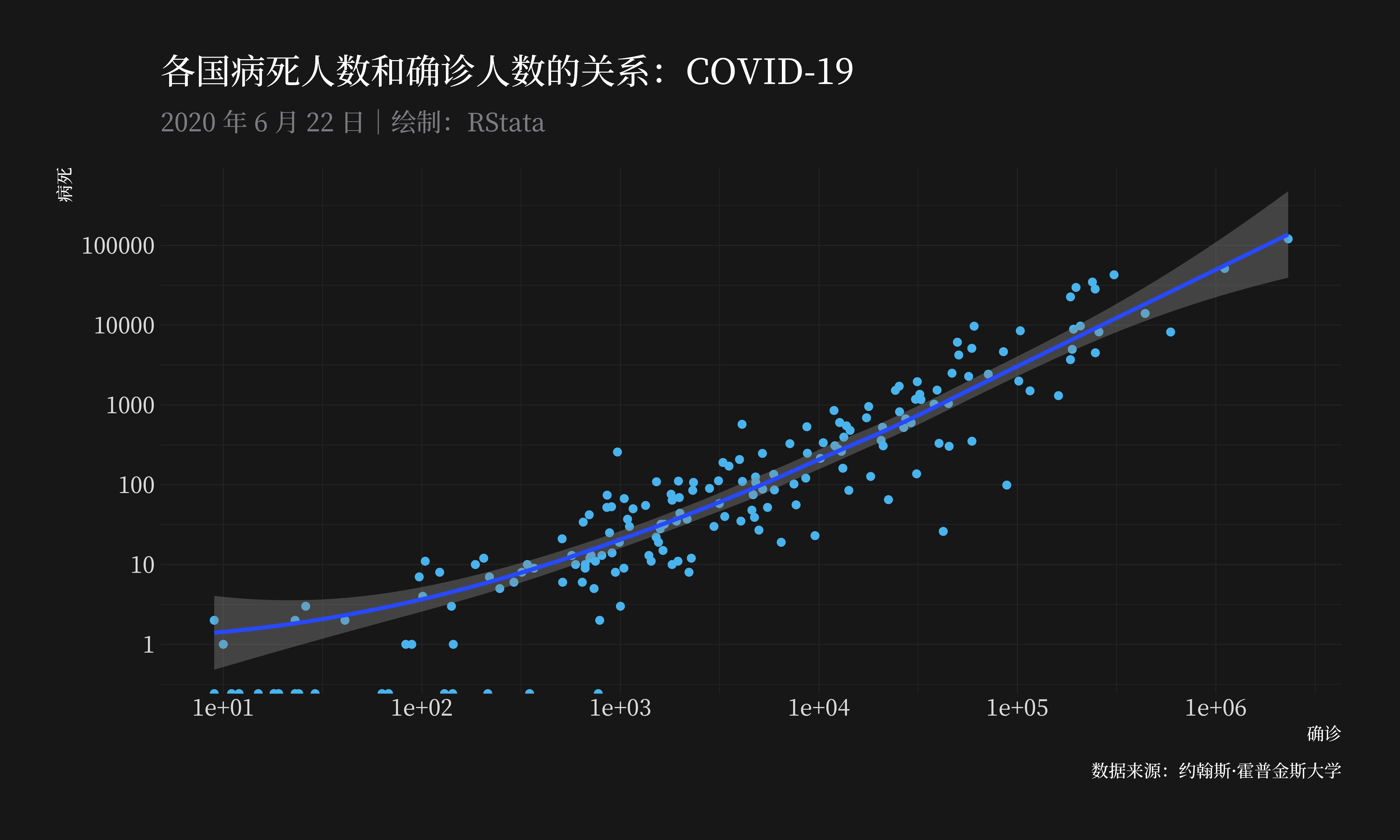
观察病死人数和确诊人数的关系:
ggplot(lastdf, aes(confirmed, deaths)) +
  geom_point() +
  geom_smooth() +
  theme_modern_rc(base_family = cnfont,
                  subtitle_family = cnfont,
                  caption_family = cnfont) +
  labs(title = "各国病死人数和确诊人数的关系:COVID-19",
       subtitle = "2020 年 6 月 22 日|绘制:RStata",
       x = "确诊", y = "病死",
       caption = "数据来源:约翰斯·霍普金斯大学") +
  scale_x_continuous(trans = "log",
                     breaks = c(1, 10, 100, 1000,
                                10000, 100000, 1000000)) +
  scale_y_continuous(trans = "log",
                     breaks = c(1, 10, 100, 1000,
                                10000, 100000, 1000000))
|
| 图一 |
 |
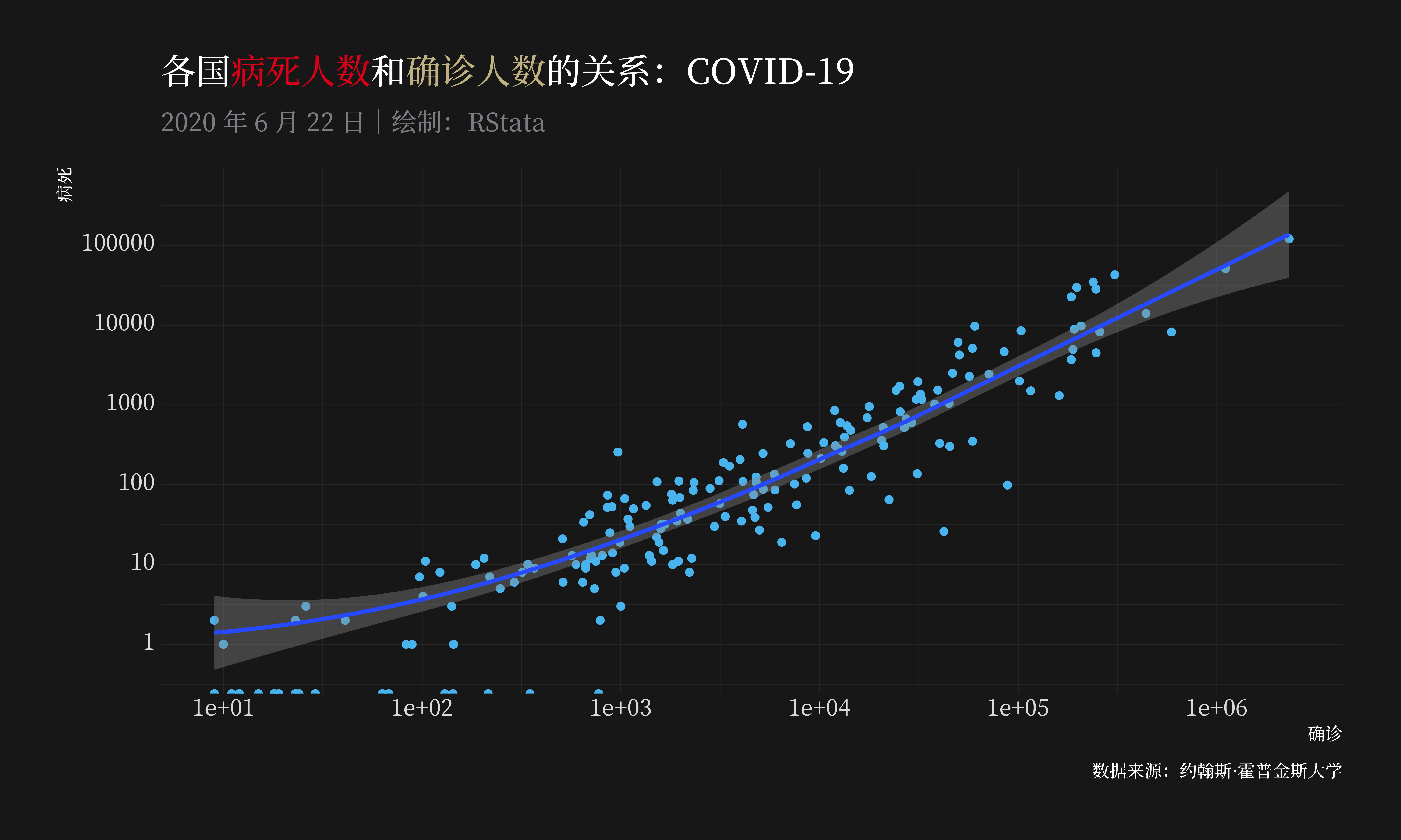
使用 md_theme_modern_rc() 代替上面的 theme_modern_rc() 就可以方便的使用 Markdown 语法修改一些元素了。
虽然我们可以使用 Markdown 语法中的 *斜体* **粗体** 等,但是这里我使用了 cnfont,这让字体的调整失去作用,所以我这里不再演示斜体和粗体的设置了。下面的代码演示了颜色的设置:
ggplot(lastdf, aes(confirmed, deaths)) +
  geom_point() +
  geom_smooth() +
  labs(title = "*各国<span style = 'color:#E31A1C'>病死人数</span>和<span style = 'color:#CCBE93'>确诊人数</span>的关系:COVID-19*",
       subtitle = "2020 年 6 月 22 日|绘制:RStata",
       x = "确诊", y = "病死",
       caption = "数据来源:约翰斯·霍普金斯大学") +
  scale_x_continuous(trans = "log",
                     breaks = c(1, 10, 100, 1000,
                                10000, 100000, 1000000)) +
  scale_y_continuous(trans = "log",
                     breaks = c(1, 10, 100, 1000,
                                10000, 100000, 1000000)) +
  md_theme_modern_rc(base_family = cnfont,
                     subtitle_family = cnfont,
                     caption_family = cnfont)
|
| 图二 |
 |
该作者还有另外一个很好用的 R 包:ggcharts,可以方便的绘制一些图表,例如这里我展示确诊人数最多的十个国家并且高亮美国和印度:
安装 ggcharts:
install.packages('ggcharts')
|
绘图:
library(ggcharts)
label <- function(x) {
if (x %in% c("美国", "印度")) {
paste0("<span style='color:#D52B1E'>**", x, "**</span>")
} else {
paste0("<span style='color:gray'>", x, "</span>")
}
}
spec <- highlight_spec(
what = c("美国", "印度"),
highlight_color = "#D52B1E",
other_color = "gray"
)
lastdf %>%
bar_chart(country, confirmed,
highlight = spec,
color = NA,
top_n = 10) +
scale_x_discrete(labels = Vectorize(label)) +
labs(
x = NULL,
y = "截止6 月 22 日确诊数量",
title = glue::glue("截止 6 月 22 日 {shiny::span('**Swiss**', style='color:#D52B1E')} 人数最多的十个国家")
) +
md_theme_modern_rc(base_family = cnfont,
subtitle_family = cnfont,
caption_family = cnfont)
|
作业:使用中国的新冠疫情数据模仿上面的代码进行分析
导入中国疫情数据:
haven::read_dta('china-covid19.dta')
|
点击这里跳转到 RStata 短书平台获取附件:mdthemes:在 ggplot2 绘图中应用 Markdown 语法
评论