之前有个培训班的小伙伴在会员群里问了个关于 ggplot2 添加图例的问题,所以我今天就帮他解决下!
注意下文代码里面的 cnfont 和 enfont 都是我在 Profile 里面设置的,如果没有设置可以参考系列课程「R 数据科学」设置或者去除相关参数。
案例引入
我们还是从案例入手,下面的案例中我使用的 2021 年 5 月 26 日世界各国的新冠肺炎确诊病例数量的数据。首先我们读取并整理这份数据(下载链接(需要翻墙):https://raw.githubusercontent.com/CSSEGISandData/COVID-19/master/csse_covid_19_data/csse_covid_19_time_series/time_series_covid19_confirmed_global.csv):
pacman::p_load(readxl, tidyverse, ggplot2, lubridate, scales, tidyr, purrr, ggrepel)
|
读取处理数据:
read_csv('time_series_covid19_confirmed_global.csv') %>%
gather(5:ncol(.), key = "date", value = "confirmed") %>%
set_names(c("prov", "country", "lat",
"lon", "date", "confirmed")) %>%
mutate(country = case_when(
country == "Taiwan*" ~ "China",
country == "US" ~ "United States",
T ~ country
)) %>%
group_by(country, date) %>%
summarise(confirmed = sum(confirmed)) %>%
ungroup() %>%
distinct() %>%
mutate(date = mdy(date),
confirmed = if_else(is.na(confirmed), 0, confirmed)) %>%
arrange(country, date) %>%
dplyr::filter(date <= ymd("2021-05-25")) -> df
|
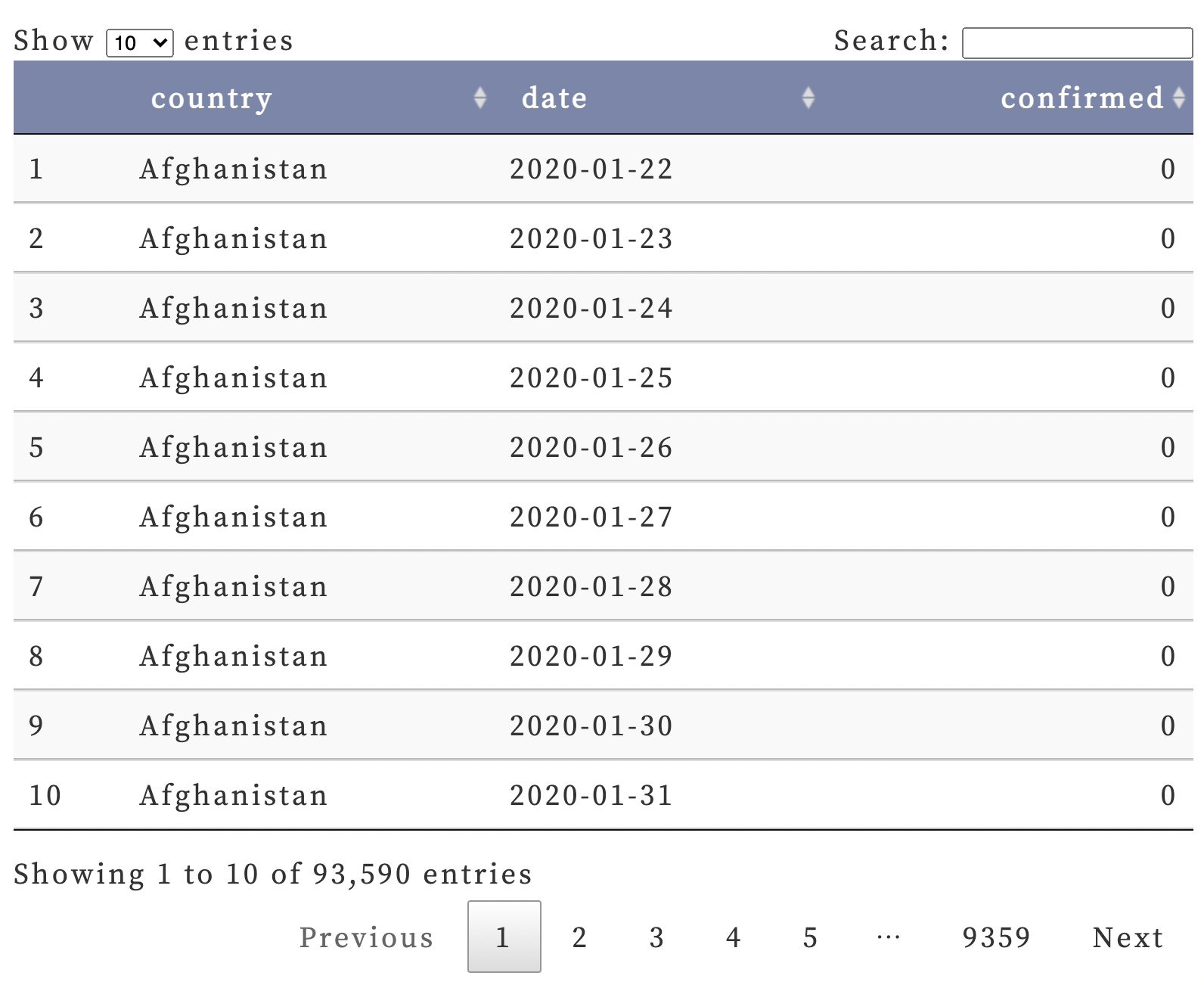
df 是这样的:
| df |
 |
2021 年 5 月 25 日世界各国的新冠肺炎总确诊病例数为:
current_total <- subset(df, date == "2021-05-25") %>%
pull(confirmed) %>%
sum()
current_total
|
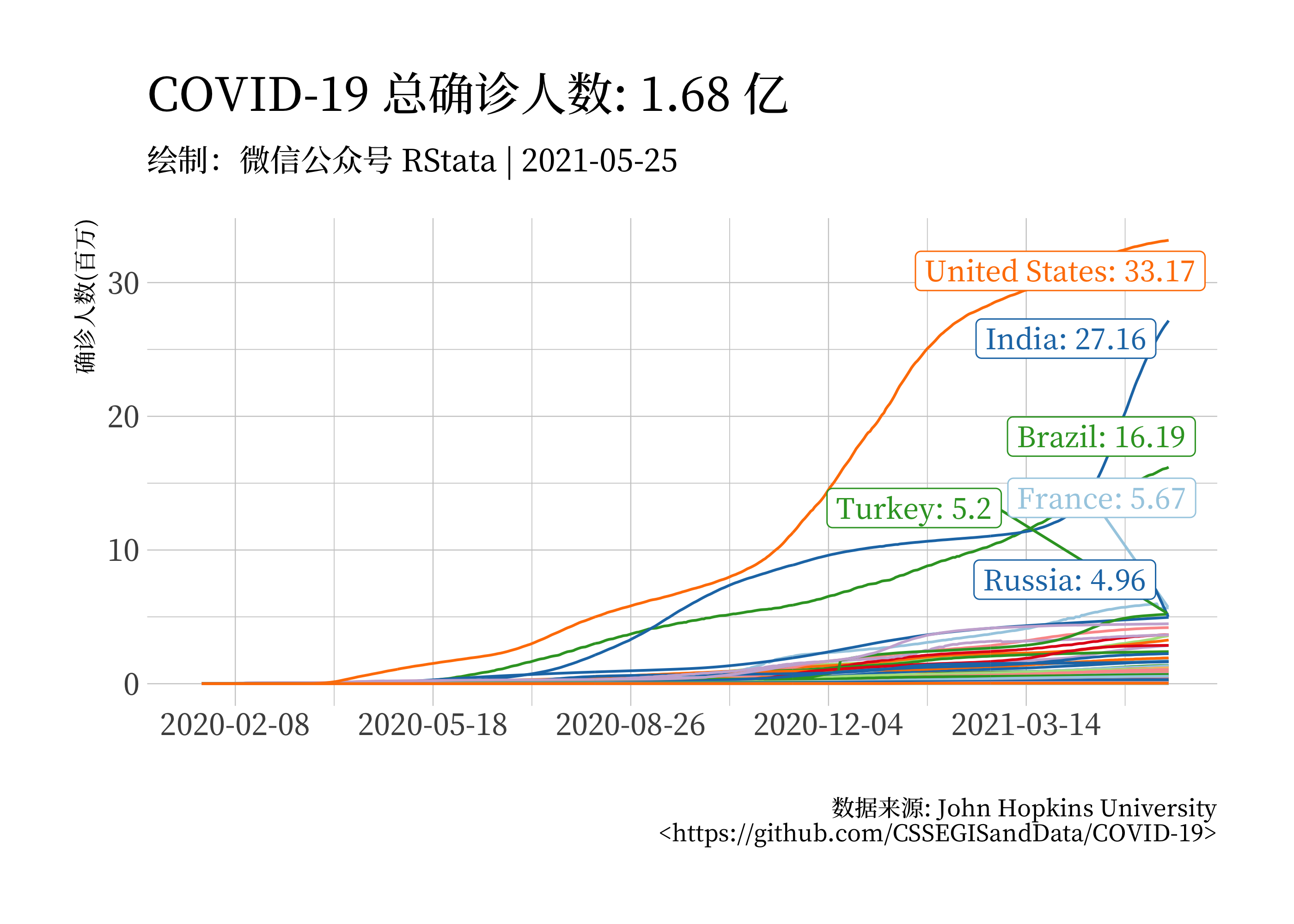
接下来绘制一幅折线图展示各国的增长趋势:
df %>%
  mutate(confirmed = confirmed / 1000000) -> df1
df1 %>%
  ggplot(aes(x = date, y = confirmed, color = country),
         size = 1) +
  geom_line() +
  geom_label_repel(data = subset(df1,
                                 date == ymd("2021-05-25")),
                   aes(label = paste0(country, ": ",
                                      round(confirmed, 2))),
                   family = cnfont,
                   max.overlaps = 100,
                   show.legend = F) +
  theme_ipsum(base_family = cnfont) +
  theme(legend.position = "none") +
  scale_x_date(breaks = date_breaks("100 days"),
               labels = date_format("%Y-%m-%d"),
               limits = ymd(c("2020-01-19", "2021-05-25"))) +
  scale_color_manual(values = rev(rep(RColorBrewer::brewer.pal(n = 9, name = "Paired"), 22))) +
  labs(title = paste0("COVID-19 总确诊人数: ", round(current_total / 100000000, 2), " 亿"),
       subtitle = "绘制:微信公众号 RStata | 2021-05-25",
       caption = "数据来源: John Hopkins University\n<https://github.com/CSSEGISandData/COVID-19>",
       x = "", y = "确诊人数(百万)")
|
| 图一 |
 |
下面我们进入今天的正题,为了方便,我仅仅选择截止 5 月 25 日确诊人数最多的是个国家,这里可以用 top_n 函数:
df %>%
dplyr::filter(date == "2021-05-25") %>%
top_n(10, confirmed) %>%
arrange(-confirmed) %>%
pull(country) -> country_list
df1 %>%
dplyr::filter(country %in% country_list) %>%
ggplot(aes(x = date, y = confirmed, color = country),
size = 1) +
geom_line() +
geom_label_repel(data = subset(df1,
date == ymd("2021-05-25") &
country %in% country_list),
aes(label = paste0(country, ": ",
round(confirmed, 2))),
family = cnfont,
max.overlaps = 20,
show.legend = F) +
theme_ipsum(base_family = cnfont) +
scale_x_date(breaks = date_breaks("100 days"),
labels = date_format("%Y-%m-%d"),
limits = ymd(c("2020-01-19", "2021-05-25"))) +
scale_color_manual(values = RColorBrewer::brewer.pal(n = 10, name = "Paired")) +
labs(title = paste0("COVID-19 总确诊人数: ", round(current_total / 100000000, 2), " 亿"),
subtitle = "绘制:微信公众号 RStata | 2021-05-25",
caption = "数据来源: John Hopkins University\n<https://github.com/CSSEGISandData/COVID-19>",
x = "", y = "确诊人数(百万)",
color = "国家")
|
| 图二 |
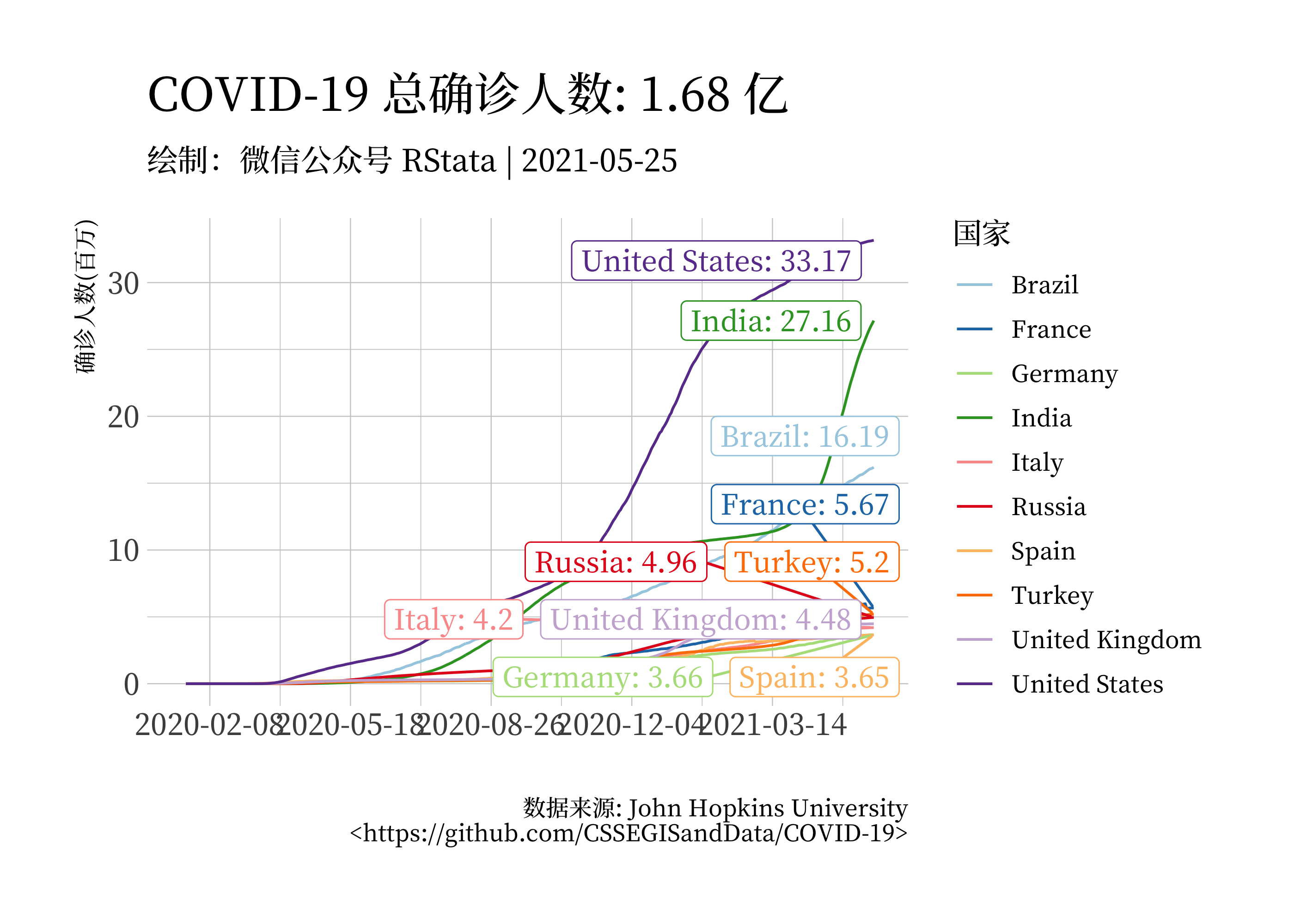 |
这个图例其实是由三个映射生成的,因为我把 color = country 放在了 ggplot() 里面,所以这个参数会传递给下面的三个图层,最后这三个映射复合在一起才形成了这样的图例。
下面我们看一下如果我们把 color 映射为 confirmed:
df1 %>%
  dplyr::filter(country %in% country_list) %>%
  ggplot(aes(x = date, y = confirmed, color = confirmed),
         size = 1) +
  geom_line() +
  geom_label_repel(data = subset(df1,
                                 date == ymd("2021-05-25") &
                                 country %in% country_list),
                   aes(label = paste0(country, ": ",
                                      round(confirmed, 2))),
                   family = cnfont,
                   max.overlaps = 20,
                   show.legend = F) +
  theme_ipsum(base_family = cnfont) +
  scale_x_date(breaks = date_breaks("100 days"),
               labels = date_format("%Y-%m-%d"),
               limits = ymd(c("2020-01-19", "2021-05-25"))) +
  scale_color_gradientn(colors = RColorBrewer::brewer.pal(n = 9, name = "Reds")) +
  labs(title = paste0("COVID-19 总确诊人数: ", round(current_total / 100000000, 2), " 亿"),
       subtitle = "绘制:微信公众号 RStata | 2021-05-25",
       caption = "数据来源: John Hopkins University\n<https://github.com/CSSEGISandData/COVID-19>",
       x = "", y = "确诊人数(百万)",
       color = "国家")
|
| 图三 |
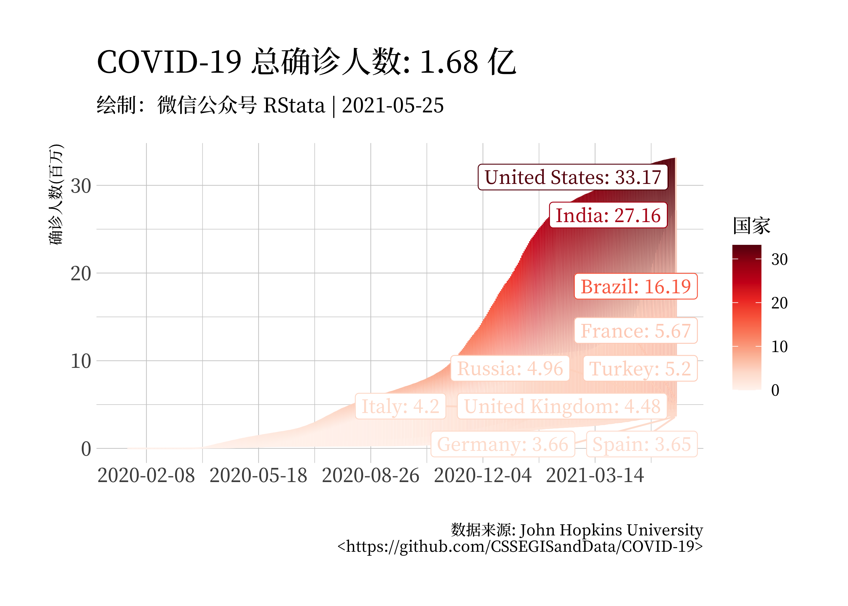 |
注意到这个时候这个图看起来就不太对了,这是因为我们把 confirmed 映射为 color 的时候 confirmed 变量也会自动被作为分组变量,所以这个时候我们还需要指定分组变量为 country: group = country
更多内容欢迎参加课程学习~
点击这里跳转到 RStata 短书平台获取附件:ggplot2 绘图中关于图例的一些 Tips~
评论