之前看过一篇文章:How to build Animated Charts like Hans Rosling — doing it all in R,这篇文章讲述了如何完全使用 R 语言创建动态图表。不过里面的代码都是非常过时的,本文使用 tidyverse 系列的代码重现了这篇文章的内容,强烈推荐学习。
本课程的附件里面有三个 Excel 数据:
人口总数.xlsx
生育率.xlsx
出生时预期寿命.xlsx
每个数据集里面都是 1800~2015 年世界各国的数据,首先我们把他们读进 R 里面并进行简单的处理:
library( readxl) library( tidyr) library( tidyverse) library( showtext) showtext_auto( enable = TRUE ) font_add( "songti" , regular = "song.otf" , bold = "song.otf" , italic = "song.otf" , bolditalic = "song.otf" ) cnfont <- "songti" population <- read_xlsx( "人口总数.xlsx" ) %>% gather( 2 : 82 , key = "year" , value = "pop" ) %>% rename( Country = `Total population`) fertility <- read_xlsx( '生育率.xlsx' ) %>% gather( 2 : 217 , key = "year" , value = "fert" ) %>% rename( Country = `Total fertility rate`) life_expectancy_at_birth <- read_xlsx( '出生时预期寿命.xlsx' ) %>% gather( 2 : 218 , key = "year" , value = "life" ) %>% rename( Country = `Life expectancy`)
在 readxl 包被开发出来之前我们经常会使用 xlsx 包读取 Excel 文件,不过这个包在读取比较大的 xlsx 文件的时候会非常慢,所以推荐使用 readxl 包。
下面我们再把这三个数据集合并在一起,三个数据集就需要两个 left_join:
mydf <- population %>% left_join( fertility) %>% left_join( life_expectancy_at_birth) %>% type_convert( ) %>% dplyr:: filter( ! is.na ( pop) , ! is.na ( fert) , ! is.na ( life) )
下面我们想在绘图的时候按照大洲进行分组,而我们现在的数据集里面是没有 洲 变量的,gapminder 包有个 gapminder 数据集,这个数据集里面有洲和国家的数据:
library( gapminder) gapminder %>% group_by( continent, country) %>% distinct( country, continent) %>% ungroup( ) -> continent mydf_filter <- mydf %>% dplyr:: filter( Country %in% unique( continent$ country) ) %>% left_join( continent, by = c ( "Country" = "country" ) ) %>% mutate( continent = as.character ( continent) , pop = round ( pop / 1000000 , 1 ) ) mydf_filter[ is.na ( mydf_filter) ] <- 0 mydf_filter
接下来我们就可以绘制动态图表了,之前我介绍的动态图表绘制方法都是先绘制一系列的静态图,然后再使用一些命令行工具合成动态图,这里既然说要完全在 R 里面完成,那就不用那个方法了,这里我们使用 gganimate 包和 plotly 包,首先是 gganimate:
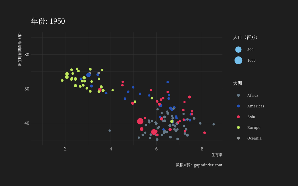
library( ggplot2) library( gganimate) mydf_filter %>% dplyr:: filter( year >= 1950 ) %>% ggplot( aes( fert, life, size = pop, color = continent, frame = year) ) + geom_point( ) + ylim( 30 , 90 ) + labs( title = '年份: {frame + 1949}' , x = "生育率" , y = "出生时预期寿命(年)" , caption = "数据来源:gapminder.com" , color = "大洲" , size = "人口(百万)" ) + scale_color_ft( ) + theme_modern_rc( base_family = cnfont, plot_title_family = cnfont, subtitle_family = cnfont, caption_family = cnfont) + transition_manual( year) + shadow_mark( exclude_layer = 1 ) -> p animate( p, res = 150 , width = 1000 , height = 625 , device = "ragg_png" ) anim_save( 'animate.gif' )
图表
这里我是筛选出了 1950 年之后的进行绘图,因为 1950 年之前的是 10 年为进度的,1950 年之后是一年为进度的。很多小伙伴使用 gganimate 包绘制的 GIF 图的像素都不高,这是因为没有进行恰当的设置,这里我设置分辨率为 300,宽 2000 高 1250,得到的图就比较清楚些。
最后我们再使用 plotly 包绘制基于 HTML 的动态图表:
library( plotly) p <- ggplot( mydf_filter, aes( fert, life, size = pop, color = continent, frame = year) ) + geom_point( ) + ylim( 30 , 100 ) + labs( x = "生育率" , y = "出生时预期寿命" , color = "大洲" , size = "人口(百万)" , title = "各国生育率、出生时预期寿命和人口数量的关系" ) + scale_color_ft( ) + theme_modern_rc( base_family = cnfont, plot_title_family = cnfont, subtitle_family = cnfont, caption_family = cnfont) ( ggp <- ggplotly( p, height = 475 , width = 775 ) %>% animation_opts( frame = 100 , easing = "linear" , redraw = F ) )
图表
这里创建的 ggp 就是一个 HTML 控件,因此我们可以使用 htmlwidgets 的 saveWidget() 函数将其保存为 HTML 文件:
htmlwidgets:: saveWidget( ggp, "ggp.html" )
点击这里跳转到 RStata 短书平台获取附件:从原始数据到动态图表 —— 在 R 中完成所有操作

评论